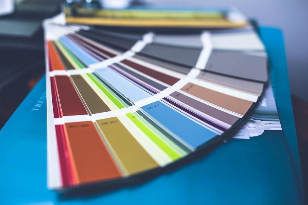
You spent a weekend rolling on that deep red accent wall, paid $55 a gallon for premium paint, and six months later it looks chalky and three shades lighter near the window. The repaint quote came back at $1,400.
Interior repaints run $1 to $3 per square foot, and a two-room job lands between $800 and $2,500. Custom-mixed deep tones cost $50 to $100 per gallon, real money for a color that fades on a 24-month cycle instead of 7 to 10 years. The wrong color or sheen can triple touch-up cost over a decade.
1. Deep Reds and Bright Oranges
Deep reds and bright oranges are the fastest faders in residential paint. The organic pigments behind these hues, including naphthol red, quinacridone, and diarylide orange, absorb UV energy and degrade when sunlight breaks the chemical bonds that hold the color together.
A south-facing accent wall in saturated red can show visible lightening in 12 to 18 months. You see a clear line where furniture blocked the wall, and the area around the window looks washed out compared to the corners.
Custom-mixed reds and oranges sit at $50 to $100 per gallon because they need heavy pigment loads. When that pigment fades a single touch-up rarely blends, so you repaint the whole wall at $1 to $3 per square foot.
If you love the look, push the saturation toward brick or terracotta, which use more stable iron-oxide pigments. The same logic applies to dining room paint colors that hold up long term.
2. Navy and Dark Blue Walls
Navy looks stately on day one and starts drifting toward purple, gray, or muddy teal within 18 months in a sunlit room. Phthalocyanine blue is more stable than red, but deep tints still rely on heavy organic colorants that break down under direct UV.
The bigger problem is uneven drift. The wall around a window fades faster than the corner near the bookcase, so you see a two-tone effect. Touch-ups never blend because the new paint matches the original swatch, not the faded section.
A custom-mixed deep navy in Sherwin-Williams Emerald or Benjamin Moore Aura costs $70 to $100 a gallon. A 12-by-14 bedroom in two coats burns through two gallons plus primer, so each redo runs $300 to $500 in materials before labor.
Pick a navy with a slight gray base instead of a pigment-heavy formula, and save deep blue for a low-light powder room. Read up on smarter ways to add color to the decor of your home.
3. Pure Black Accent Walls
Pure black walls look dramatic on the sample card and create real problems on a living room wall. Black absorbs the full visible spectrum and converts it to heat, which raises surface temperature and accelerates binder breakdown. The result is chalking, a powdery residue you can wipe off with your finger within a year or two.
Burnishing is the second issue. Every wipe with a sponge, brush from a chair, or pass of a vacuum hose polishes the matte film into shiny streaks that read as damage.
A repaint of a single black accent wall runs $300 to $700 once you include the second coat black almost always needs. Roll it into a two-room job and you are looking at $800 to $2,500 at standard contractor rates.
If you want the moody look, use a near-black in eggshell or matte ceramic, which resists burnishing better than flat. For a cheaper path to the same drama, see low-cost ways to give your home a new look.
4. Trendy Bright Accent Colors
The trendy color that hit Instagram last year is the one a manufacturer quietly discontinues this year. The custom-mix formula gets archived and your touch-up paint will not match. You repaint the whole wall or live with the patch showing.
That is the hidden cost of chasing color of the year. A wall in a discontinued shade often needs a full repaint to fix one ding, which means $400 to $900 for a 200 square foot room at $1 to $3 per square foot.
Trendy brights also use the organic pigments that fade quickest. A vivid coral, electric teal, or saturated chartreuse loses 20 to 30 percent of its chroma inside two years, even in Behr Marquee or Valspar Reserve.
Stick to the manufacturer’s core deck for permanent walls and save trend colors for furniture or an art frame. If you are repainting to lift resale, see proven ways to increase the value of your home.
5. Flat Finish in High-Touch Rooms
Flat paint hides drywall imperfections, which is why builders default to it. The trade-off is an open surface that grabs fingerprints, scuff marks, and the dark line your couch leaves on the wall.
Cleaning a flat wall creates a shiny halo. Mild abrasion from a sponge polishes the surface and leaves a spot brighter than the surrounding paint. Most homeowners cover it with a touch-up that flashes a different sheen and makes the problem worse.
A two-room repaint to fix scuffed hallway and family-room walls runs $800 to $2,500. The frustrating part is the paint may be fine, you just chose the wrong sheen.
Move to eggshell or satin in hallways, kids’ rooms, and family rooms, and reserve flat for ceilings. Sheen choice fits into smart upgrades that increase home value.
6. Low-VOC Budget Paints With Light Pigment Loads
The bargain gallon at $25 to $35 looks like a deal until you open the can. Budget low-VOC formulas use less titanium dioxide and less colorant per gallon, which means lower hide, lower scrub resistance, and faster wear.
The gap between budget paint and a premium line like Sherwin-Williams Emerald, Benjamin Moore Aura or Regal, Behr Marquee, or Valspar Reserve is $30 to $70 per gallon. A budget paint usually needs three coats while a premium covers in two.
Three coats of a $30 gallon costs more in product and labor than two coats of a $70 gallon, and still scuffs and fades faster. A repaint at $1 to $3 per square foot runs $400 higher when the original failed early.
Buy the premium tier in any room with sun, traffic, or saturated color, and save budget paint for closets. The same logic applies to a contemporary living room that holds its look.
7. Single-Coat Coverage Marketing Claims
“One-coat coverage” is the most expensive promise on a paint can. Real coverage on a color change needs two coats and often three. The claim only holds on a same-color refresh over a clean primed wall.
When you trust the single-coat claim, color sinks unevenly into the substrate and you see flashing, streaks, and roller marks within days. The fix is another full coat over the entire wall.
Custom-mixed gallons in deep tones run $50 to $100 each. Buy two gallons expecting one-coat coverage, then buy two more for a second coat, and you doubled material cost before your weekend.
Plan for two coats on any new color and three when going light over dark or covering deep red, orange, or yellow. Doing it right the first time saves you from the backtracking in bathroom renovation mistakes that cost homeowners thousands.
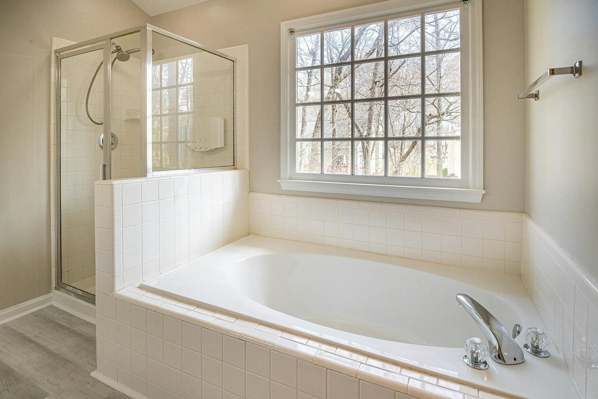
8. Wrong Sheen in Kitchens and Bathrooms
Eggshell falls apart on a kitchen wall above a stove or a bathroom wall across from a shower. It has enough surface texture to grab grease, steam, and hard-water minerals, and not enough resin density to wipe clean without polishing the finish.
Within a year you see ghost spots where the wall got cleaned, and an oily band along the splash zone behind the range. The paint is the wrong tool for that room.
Satin is the right call in kitchens, baths, laundry rooms, and mudrooms. A premium satin like Sherwin-Williams Emerald Satin runs $70 to $90 a gallon, and one kitchen needs one to two gallons. Switching sheens adds nothing to the $1 to $3 per square foot labor rate.
If your kitchen or bath already shows wear, repaint with the correct sheen instead of touching up over eggshell. Pair that switch with smart ways to update your home and low-cost lighting upgrades.
What Actually Works: The Right-Paint-Right-Room Plan
You do not need to give up color. Match color, sheen, and paint tier to the room, the light, and the traffic. Premium paint in a stable hue at the right sheen lasts 7 to 10 years. The wrong combination puts you on a 2 to 3 year cycle and triples touch-up cost over a decade.
Start with the premium line for any room with direct sun, kids, pets, or steam. Stick with the manufacturer’s core deck for permanent colors, and save trendy shades for furniture or one small accent space.
Plan on two coats for a refresh and three for a color change, and buy enough paint to finish in one trip. That decision saves $100 to $200 in returns and ties into long-term value upgrades that pay back over the years you live there.
- 1share
- Facebook0
- Twitter0
- Pinterest1